Data analysis is the key to creating a successful business and ensuring its progress. It is safe to say that not only businesses but most of our world runs on data and its analysis. Therefore, it is extremely important to know how to create and analyze data charts, and one of the most infallible ways to do this is using a Google Forms pie chart.
In this article, you will learn how to make a pie chart with your Google Forms results, learn about the very helpful and detailed “Statistics” page of forms.app, advantages of using graphs in Google Sheets, and take a look at some of the frequently asked questions about converting Google Forms answers into pie charts.
How to make a pie chart with your Google Forms results
Understanding how to get pie chart results on Google Forms takes several steps and requires you to integrate your Google Forms data with Google Sheets. Surprisingly, Google Forms pie chart results are generated automatically after you collect your responses. However, if you would like to have a more detailed analysis, you need to use both Google Sheets and Google Forms.
1. The “Responses” tab
After you create a Google Forms form, you can look at the results in a pie chart by going to the “Responses” tab, but the pie chart will only be shown for questions that are set up as multiple-choice questions. That means that the chart type will change based on the question.
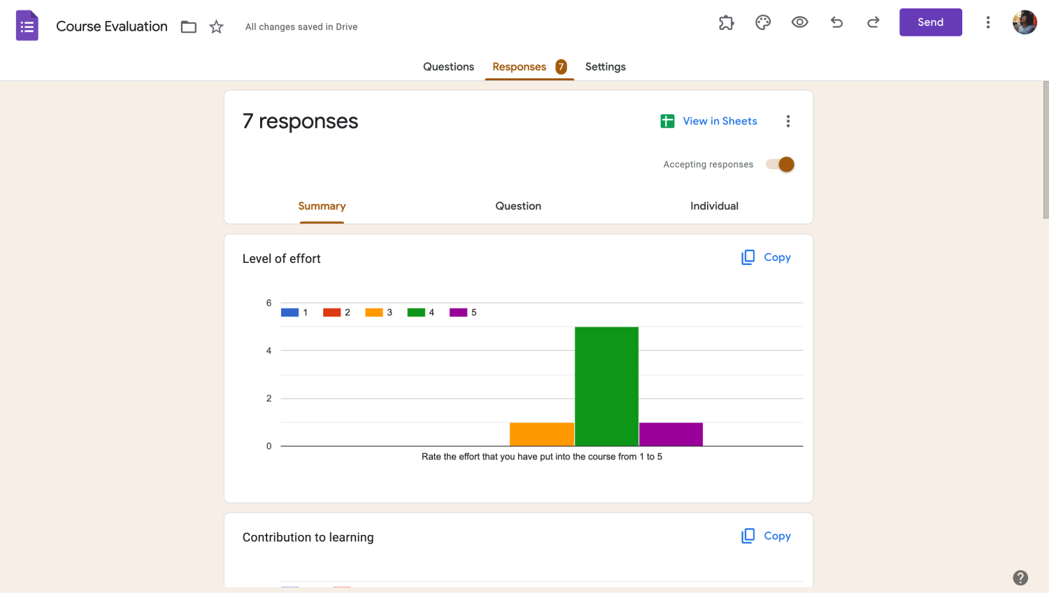
Go to the Responses tab
While some creators may find this satisfactory, if you need a more detailed approach to analyzing your data, you must set up your charts using Google Sheets. To create a pie chart using Google Sheets, you have to follow several simple steps, which we will get to now.
2. Link your form to Google Sheets
The first step of creating a pie chart using Google Sheets is linking your form to Google Sheets. To link your form to Google Sheets, go to the “Responses” tab and click on “View in Sheets.” This action will take you to a menu where you can either create a new spreadsheet or link the results of your form to an existing spreadsheet.
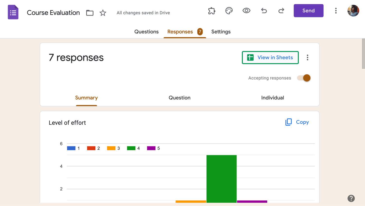
Link your form to Google Sheets
3. Create a pie chart within Google Sheets
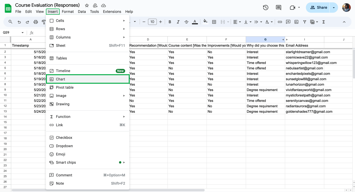
Create a pie chart
After you open the spreadsheet to which you have connected your results, you must highlight the cells for which you would like to create charts. Once you have selected the cells, select “Insert” from the upper left side and “Chart” from the dropdown menu. This action will open up a menu from the side and bring a column chart in front of you.
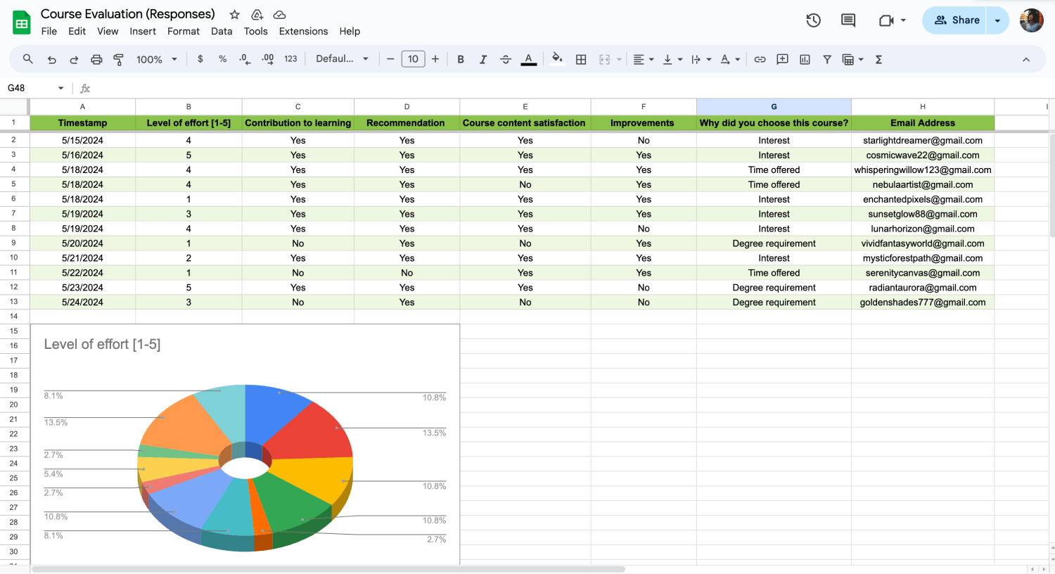
Customize the chart settings
To change the chart type and add a pie chart in your spreadsheet, click on “Column chart” to access the chart editor and scroll down until you see the selection of pie charts. Once you select the chart that you are satisfied with, you can change other settings such as the data range, label, or other settings.

💡If you would like to access additional settings and the setup tab is not enough for you, you can access the “Customize” tab.
forms.app: Statistics
A better and more accessible alternative to the process of integrating your responses and creating charts in Google Sheets is using the “Statistics” tab in forms.app. The statistics tab can be accessed through the “Results” page, and it frees you from the hassle of having to integrate your responses into another platform. You can think of the “Statistics” tab as a mix between Google Forms and Google Sheets.
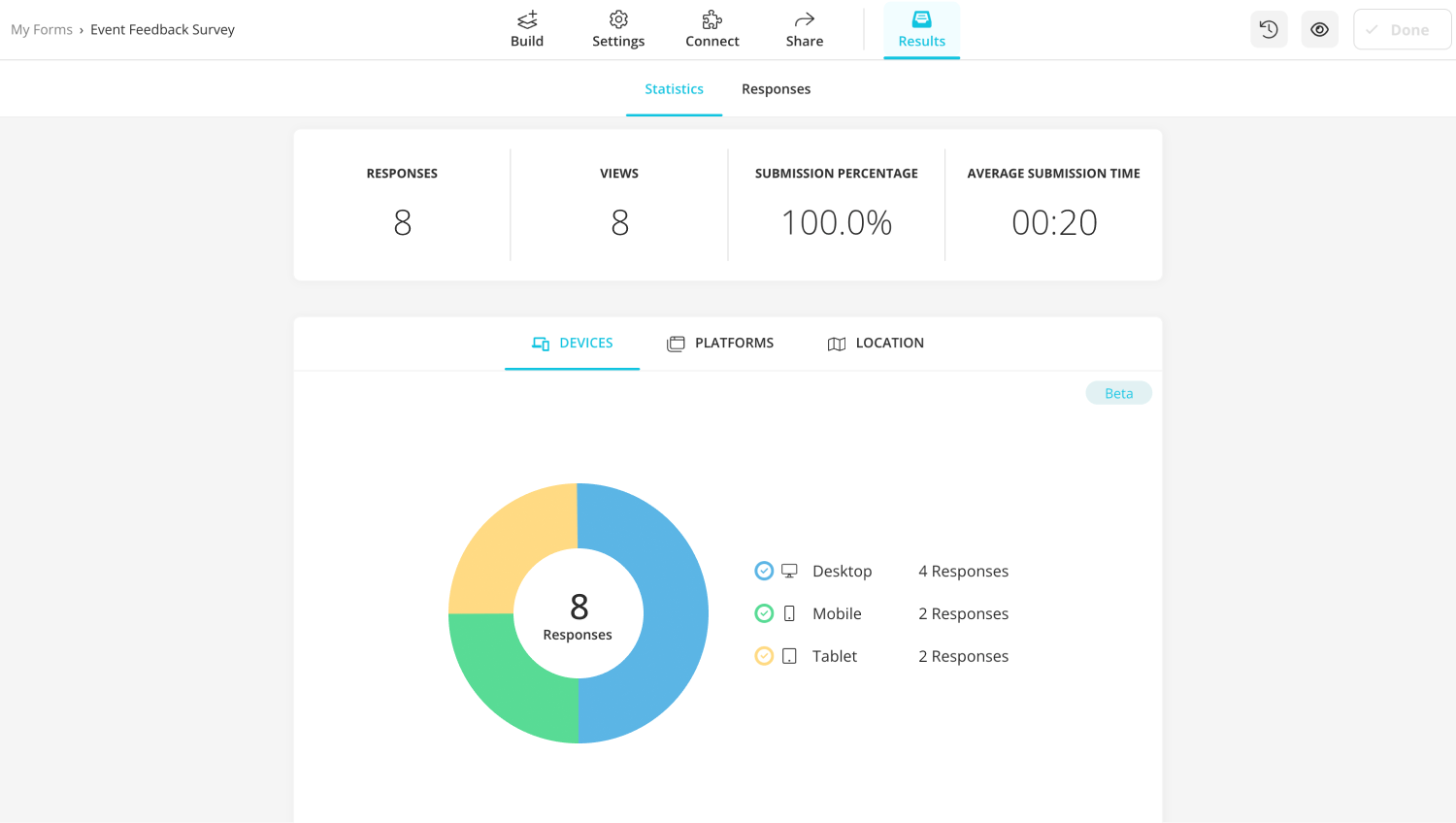
Statistics tab of forms.app
The statistics tab allows you to see how many responses and views your form has gotten and gives you to see the data visually with the help of submission times and submission percentages. Furthermore, you can also see which devices and platforms were used to submit your form, and even see the locations of the people who have submitted.

💡You can also connect your form to Google Sheets and many more databases using the “Connect” page.
Advantages of using graphs in Google Sheets
Using graphs and charts in Google Sheets may not seem like much; you may think that they are just fancy visuals. However, they are the key to understanding the data that you have collected. They are also a great way to present said data. While using graphs and charts in Google Sheets have many more advantages, some of the key points include:
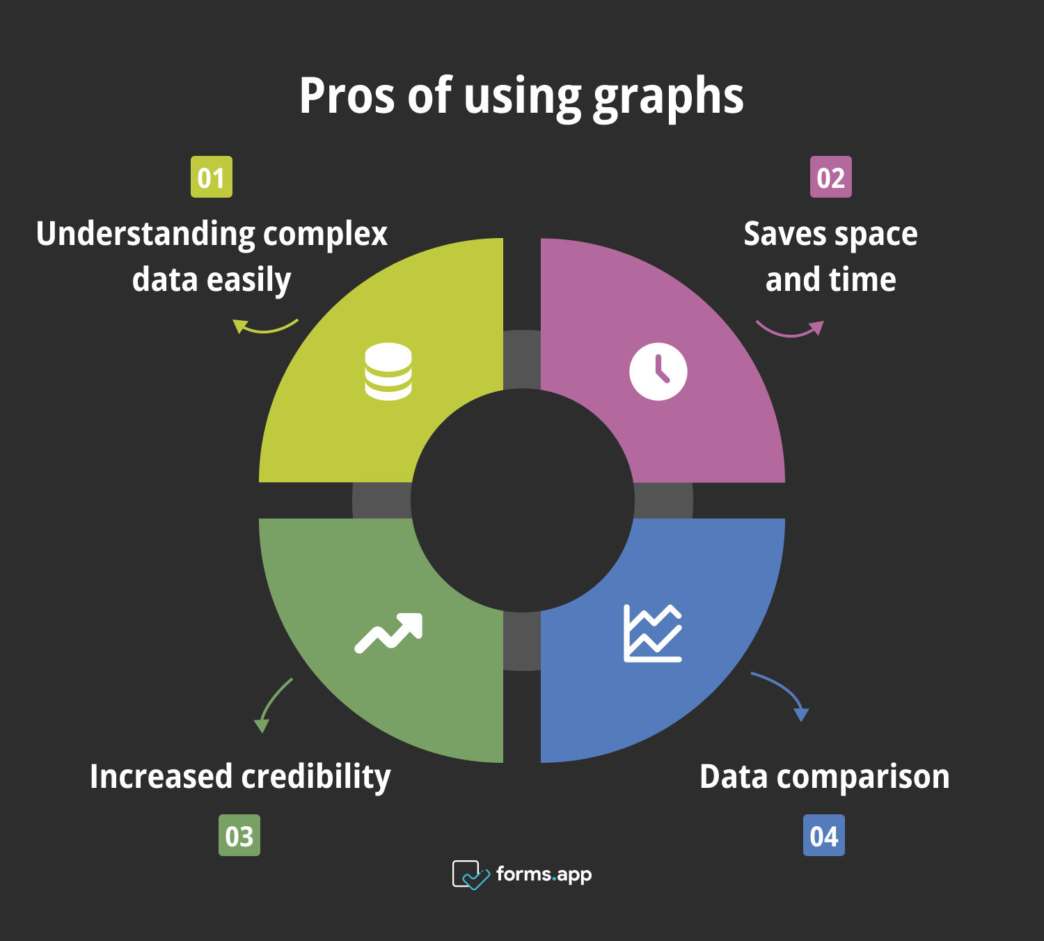
Benefits of using graphs
- Understanding complex data easily: Graphs and charts help you analyze and understand complicated data that you have collected from reports such as a survey report much more easily and present it in a more organized manner.
- Saves space and time: Charts and graphs can also help you save time and resources by conveying a large amount of information in a compact space.
- Increased credibility: Having charts in your spreadsheets also shows that you have done your research and analyzed the data, increasing your credibility and authority.
- Data comparison: Graphs and charts help you compact the data that you have collected, and they also allow you to make comparisons and further analyses faster and without fewer errors.
Frequently asked questions about converting Google Forms answers into pie charts
Now that we have understood the how and why, it is time to learn about the details when it comes to converting Google Forms answers into pie charts by way of frequently asked questions.
Google Forms automatically converts your data into a graph within the “Responses” page. However, if you would like a more detailed graph, we recommend following the steps above to create one using Google Sheets.
Google Forms gives you a bar chart depending on your question types within the “Responses” tab, but knowing how to change the chart type in Google Forms requires you to carry your data to Google Sheets and follow the same steps for creating a pie chart.
Fortunately, Google Forms automatically visualizes your data within the “Responses” page, but if you would like to have a more detailed visualization, we recommend using Google Sheets and creating a graph, or using forms.app. You can also look at our line graphs in Google Sheets article to learn more about visualizing your data.
To turn your Google Sheets data into a pie chart, simply highlight the cells that you would like to create a chart with, click on “Insert”, and select “Chart” from the dropdown menu. Afterward, click on “Column chart” and change the chart type by scrolling down until you see the pie chart options.
Final words
In summary, knowing how to analyze your data and present it in a more accessible way requires you to understand how to create a pie chart within Google Forms. Not only does creating a chart or a graph for your data help you save space and time when it comes to the analysis and presentation processes, but it also helps you to make further analyses easier and with fewer errors.
We have discussed how to create a pie chart using Google Forms data, a better and more accessible way of visualizing and analyzing your data with forms.app, and the advantages of using graphs in Google Sheets. We have also answered some of the FAQs about converting Google Forms answers into pie charts. Now it is time for you to create the best charts and graphs you can.
Yakup is a content writer at forms.app. He is also a skilled translator. His hobbies include reading, learning about different languages, and different branches of sports. Yakup's expertise lies in translation, NoCode tools, and Google Forms.


 4 min read