The competition is fiercer than ever, making it harder to generate leads and grow your website traffic. The target clients who complete the forms turn into leads. The lead turns into a prospect when they reply favorably to your outreach and turn out to be a qualified prospect.
For most organizations, generating leads is essential since, without leads, there would be no sales and no revenue. According to a Hubspot report from 2020, only 22% of the firms were satisfied with their form conversion rates.
Forms, quizzes, and surveys are the lifeline of B2B marketers. Contact forms, signup forms, webinar registration forms, ebook download forms, demo request forms, and so on are typically needed to collect and move leads across the funnel. The issue is that completing web forms is so tedious these days that most of us lose interest in filling the entire one. Read on to learn eight online form design tips to boost conversions for your brand.
9 best design tips to boost response rates of your forms
The forms, quizzes, and surveys are essential to your business and the outside world. A form is a medium through which consumers can get in touch with you directly. You can make use of social media automation to get your customers to fill up your feedback forms and quizzes and make the necessary changes. Apart from that, you can embed forms on your website to get leads.
Increasing the form's conversion rate for your business can significantly impact your marketing and sales. You can follow the tips mentioned below to ensure that your forms, quizzes, and surveys are appealing, comprehensive, and responsive.
1 - Keep fewer form fields
The goal is to make the form as simple as possible for your visitors to increase the conversion rate. Having a complicated structure is challenging as it results in higher abandonment rates. Another primary reason to keep fewer fields is the rise of internet usage across mobile phones.
People often dislike sharing personal information like their addresses and phone numbers.
So asking more may lead to a significant amount of abandonment. Make sure to frame your forms, quizzes, and surveys in an easy and quick way to fill out. Users are more likely to respond to your form if they don't have to spend a lot of time filling it out.
2 - Create separate forms according to different user intent
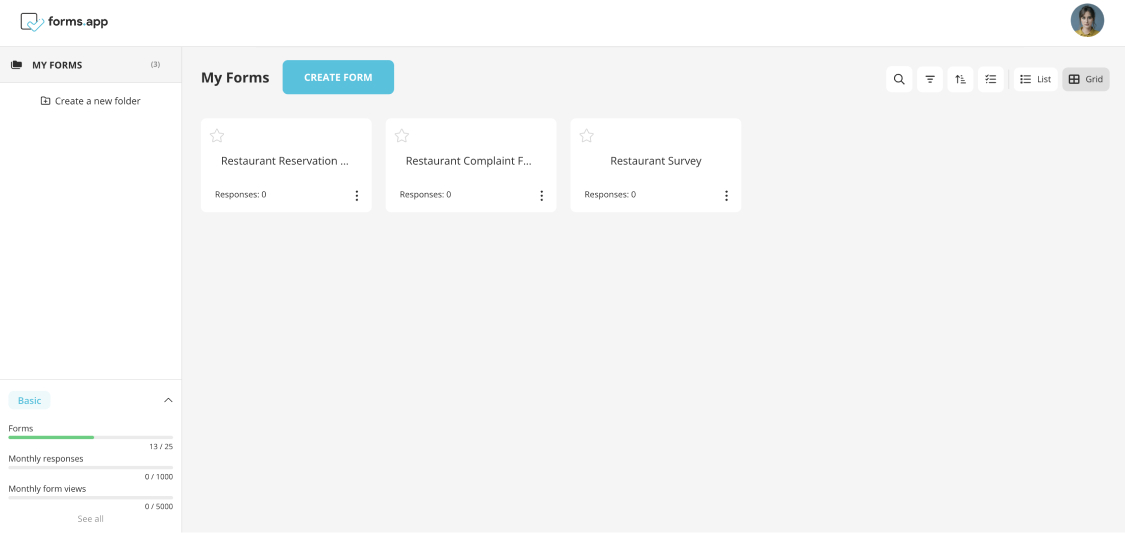
Nowadays, businesses frequently utilize online forms since they quickly and effectively collect customer information. You can have two forms based on the user intent—one with a simple structure and the other with a detailed one.
For instance, based on the type of user persona, the forms can be given based on the type of information required. You can create different forms for students, working professionals, and others based on their needs.
You can also carefully consider your language on your web forms, quizzes, or survey. Not everyone who visits your website may speak your native tongue. Additionally, it also applies to the form labels and your error messages.
For instance, you can create two different forms to engage with your community audience. You can use different languages if your business wants to reach a global audience. You can have two forms in your native and English languages. Managing your community online can be super difficult but is very important, and you can always consider using a community management tool for it.
* * *
3 - Explain what is to be filled in a field
Make sure the customer isn't the one asking the questions at the end of an online form you've prepared. Try to be sure that any information you request from them can only be used for the purpose for which it was intended. Although you can't change how people think, you can prevent communication errors using clear, succinct, and straightforward language.
Make sure you use the placeholder text and the text above the placeholder to give proper context. Provide straightforward information; for example, you can provide examples if you expect an answer in a long-form text. You can give an example or provide instructions to assist the users.
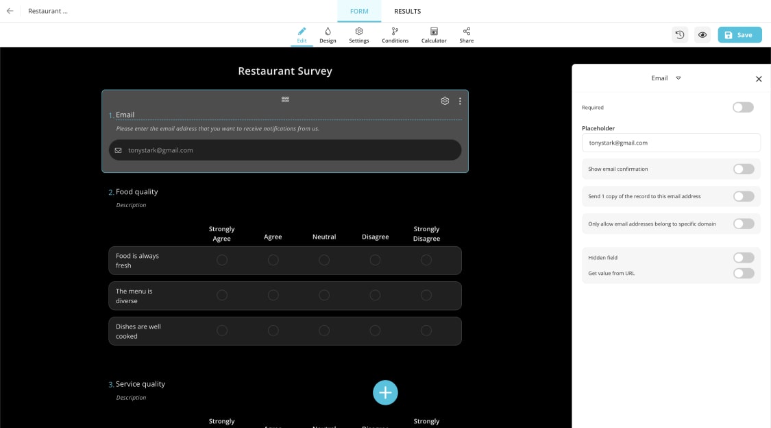
For instance, if you own a restaurant and want customer feedback to improve your social presence, you can use social media for restaurant marketing by conducting a limited survey with minimal questions. You don't need their personal information because they are already your customers; directly ask questions with options about the ambiance, food taste, quality, quantity, etc. Their responses can assist you in making improvements.
4 - Choose the correct question types
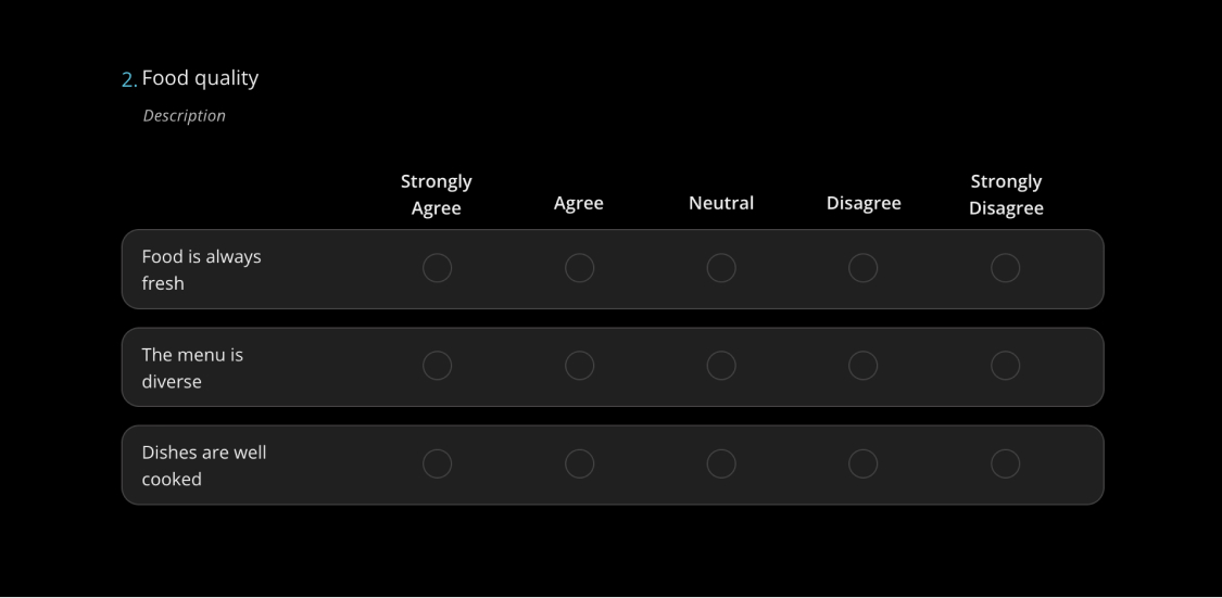
One such approach is to provide options rather than requiring a text field to be filled out by the user. You can consider using choice questions, such as single selection, multiple selections, or selection matrix fields. Using these fields, the user can choose one option from a group.
To ask someone about their availability, use the date field for the days they are available rather than a text field where they must manually enter the days and times. Try to stop the user from typing, so you can keep them from giving up, especially if a simple solution is available.
* * *
5 - Design for the mobile experience
It's no secret that customers today use their mobile devices to browse websites, make purchases, and complete forms. Thus, it's essential to use mobile-friendly form designs. By doing this, your visitors can access your website on any mobile device easily, the form's information will fit on the screen it is being read on, and users will find it simple to fill out and submit the forms while on the go.
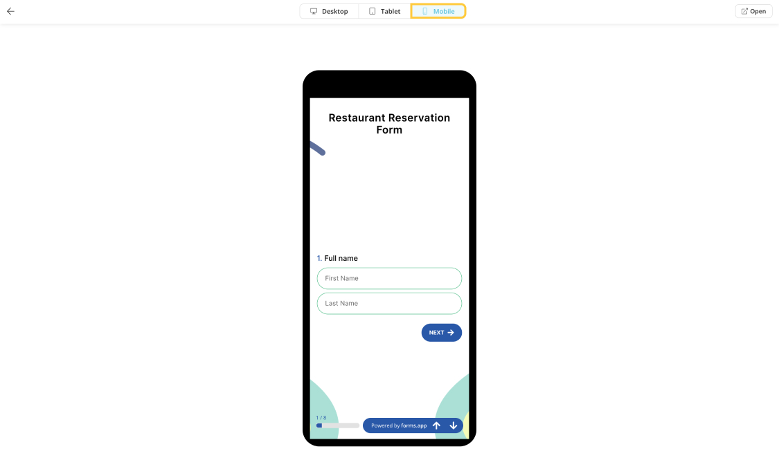
Nowadays, almost everyone always has some mobile device with them. Consumers are subscribing to your newsletter, creating accounts, and making purchases on their smartphones and tablets when they're out and about, traveling, commuting, or just lounging in the comfort of their own homes. Your website absolutely must include mobile-friendly forms because of this.
6 - Don't use discouraging submission fields
There are many discouraging fields like human verification (CAPTCHA), long addresses, and unnecessary information in forms that can easily take away the user's interest. Recaptcha creates a formidable barrier for all users attempting to fill out your form, including leads, contacts, and spambots.
Lowering the barriers between your product or service and the customers who desire it is a basic tenet of any business. Three significant reasons that Recaptcha and long address harm your forms are the following:
- Accessibility
- Conveniences
- Conversion
7 - Use the correct layout
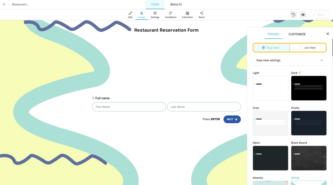
Thanks to the inline field labels and text; visitors will find it easy to understand where they should enter their responses in your forms, quizzes, or surveys. They make it straightforward for visitors to proceed through the form without hesitation by eliminating the guesswork of which label goes with which field. They also maintain your form's neat, uncluttered, minimalist, and sleek appearance.
* * *
8 - Write a good CTA
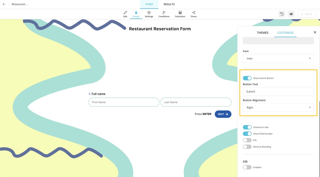
You can make the most of your submit button by selecting the correct wording. Use verbs that convey action to let them know what is occurring. For instance, using words like "Submit Now," "Request Price," or other similar expressions alerts the user to what is happening.
* * *
9 - Reduce/Remove any friction
Make sure that you reduce any friction that causes the high bounce rate. Once you analyze the forms, quizzes, or survey responses, you can understand how many users started and traveled throughout the form to complete it. One major tip to remove distractions is not to clutter the options and questions and to have it as simple as possible.
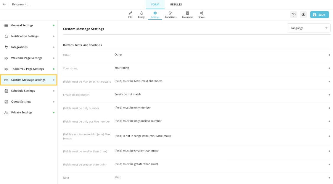
Be sure to seem upbeat when writing web form error messages, which is an efficient approach to ensure that only accurate information is submitted. Never point the finger at the user; instead, use clear, succinct language and provide information that suggests the visitor to the problem so they know where it is and how to fix it.
Conclusion
Simply asking for information is insufficient. Your forms must provide a simple user experience to generate leads. You'll also need enticing offerings that are backed up by outstanding design and the right content.
Becoming an expert in forms, quizzes, or survey conversion will take time. Remember that you will need to experiment to improve your conversion rate. Try out a few methods that are determined and most effective. Observe the experiments and document the finest practices that work for your company.


 7 min read