The evolution of email as a form of communication is not at a standstill; we are always acquiring new ways to use this tool more effectively. One is by adding interactive content.
In this article, we're going to explore how adding fun things like quizzes, forms, games, and more can make your emails extra engaging. We'll talk about the different kinds of interactive content, why they're awesome, when it's best to use them, and how to make your email newsletters stand out and work better.
Benefits of interactive content in email marketing
Before upgrading your emails with interactive elements, it's worth looking closely at the benefits that can be obtained by adopting such an approach and some statistics that prove the power of email interactivity.
- The overall effectiveness of emails with interactive content is recognized by 52% of marketers.
- Simple and engaging data collection using quizzes and polls will help with audience segmentation and allow you to create more precise and personalized newsletters in the future.
- Engagement will increase as you implement interactive elements that are more engaging than just plain-text emails.
- Open rates will increase as your subscribers will be intrigued by your use of interactive content and what they can expect from your future newsletters.
- Brand differentiation and overall brand awareness will improve as your emails will provide unique interactive content that helps you stand out from the competition. Subscribers can also share this content with each other.
- Adding interactive elements to your emails can raise ROI by up to 300%.
As you can see, interactive content in emails carries tangible benefits, especially in terms of the desire to receive them, which leads to a situation similar to the one shown below.
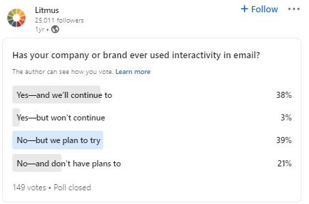
Source: Litmus LinkedIn
Litmus conducted a survey on their LinkedIn page and found that 38% of marketers already use interactive elements in their email newsletters, and an equally large percentage plan to implement them in their future email marketing efforts. Marketers are generally open to new tools that can make their email marketing efforts more effective and help them reach new heights in their craft.
Interactivity in emails: When to use it and what makes it effective
Having reviewed the main benefits that interactive elements can bring to your email newsletters, it's time to talk about these elements in more detail. What are they? How do they look? What makes them effective? We will answer these common questions below.
1. Forms & surveys
Every business owner wants to know their clients better to make smarter business decisions.
Emails with forms are one of the most convenient and efficient tools for collecting customer feedback, preferences, etc.
Interactive forms enable recipients to provide feedback, answer questions, or submit information directly within the email, enhancing engagement and interactivity.
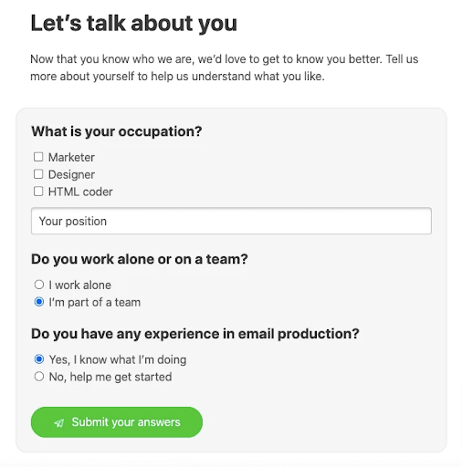
Email from Stripo
Despite their advantages, however, if your form contains over four questions, it is best to use an external form, which you can build using forms.app and then easily integrate into your newsletter. For example, Adweek created a marketing personalization survey that could be accessed through a link provided within its email.
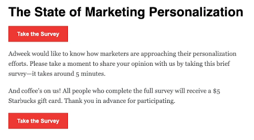
Email from Adweek
It is important to remember that the type of form you will implement depends on the number of questions you want to ask. With fewer than four questions, interactivity is your best tool. With more than four, you should consider adding links to third-party tool forms in your emails.
What makes it effective?
Forms are a highly effective interactive element, but it's crucial to adhere to several rules that will help you make effective forms:
- Be clear about the form's purpose.
- Reveal the expected completion time.
- Mention a deadline if there is one.
Recipients must know why they need to fill out the form and how much of their time it will take. These gestures will show that you respect your recipients' time, which will help further humanize your brand.
2. Quizzes
Quizzes are a great way to make your newsletter not only more engaging but also more educational. Depending on your industry, quizzes can be an element of entertainment (for example, a quiz could be about cinema knowledge, the main prize of which would be themed merch) or an educational tool (through which you inform the recipients about something interesting or introduce them to a specific world problem).
For example, the book-selling platform Yakaboo created a quiz with questions about Ukrainian culture, history, and language.
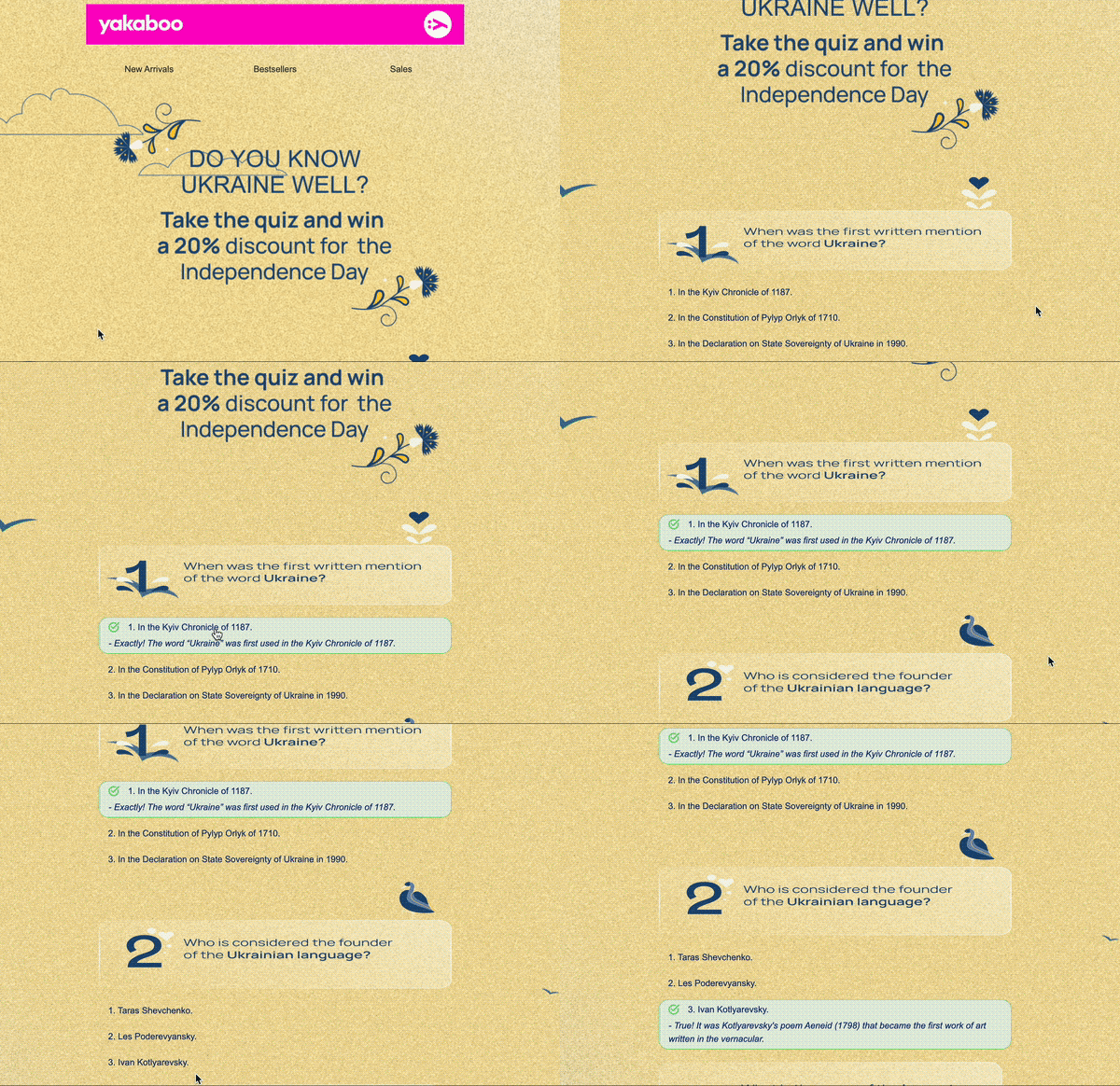
Email from Yakaboo
What makes it effective?
Quizzes can be an effective way to make the interaction experience enjoyable, informative, and effective from an engagement perspective, but only if they do the following:
- Contain straightforward questions.
- Are complemented with engaging visuals.
- Provide immediate feedback.
Quizzes with straightforward questions, engaging visuals, and immediate feedback make the interaction experience enjoyable, informative, and effective from an engagement perspective.
3. Rating/NPS
These interactive elements offer other ways of collecting feedback on your services, products, and so on. At the core, you are asking the recipient to answer a short question or give a rating within a selected range, which will then help you improve your services.
Stripo is a great example of an NPS implemented in the right way. In this case, their marketers created an NPS email for their audience about their satisfaction with their email template kits. Recipients could rate their satisfaction using an attractive star graphic.
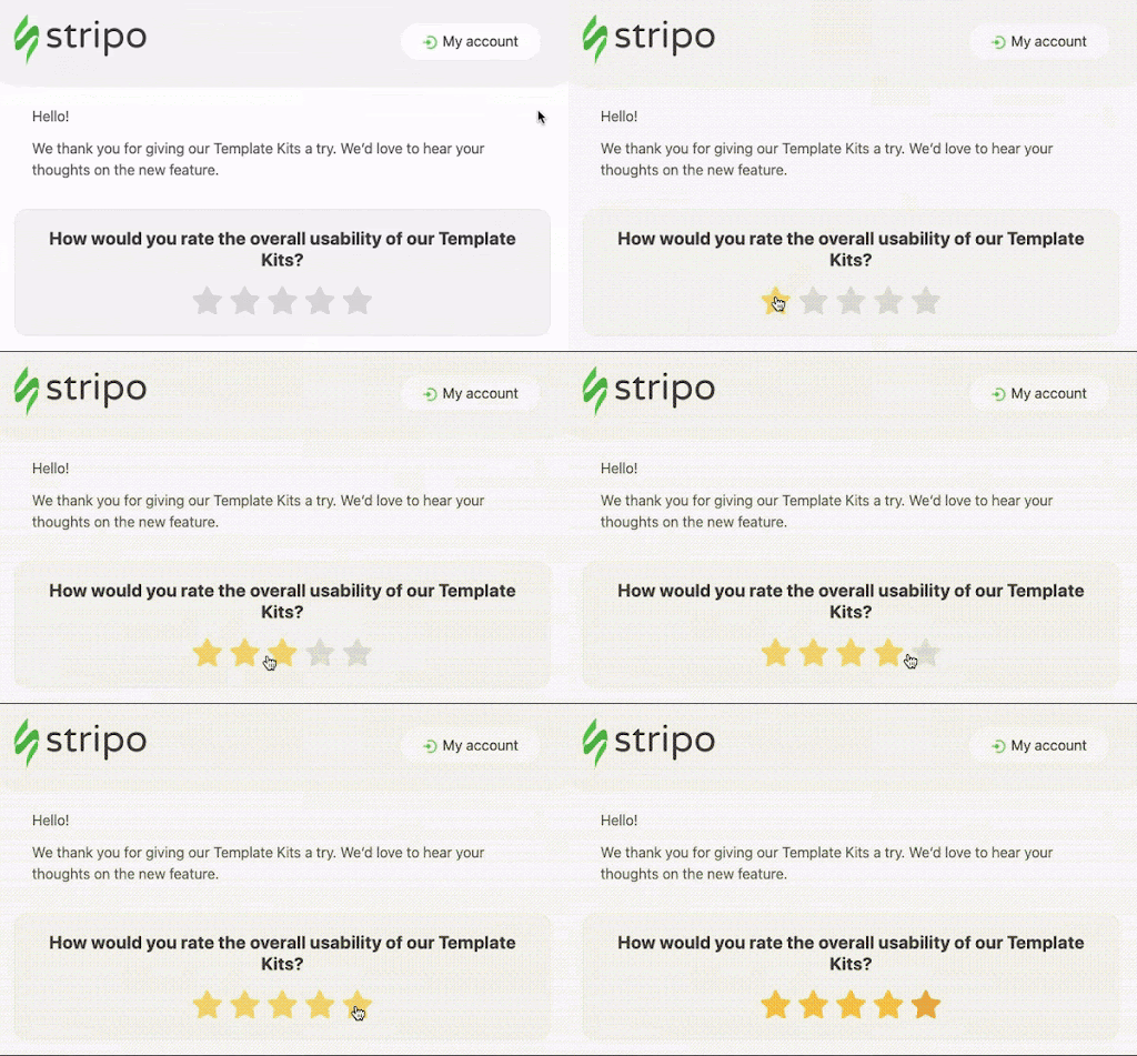
Email from Stripo
What makes it effective?
These surveys work great when they:
- Are accompanied by clear explanations.
- Show their intent to the recipient.
Combining these two elements will ensure a proactive approach to maintaining customer satisfaction and trust.
4. Gamification
Email gamification is a marketing strategy that incorporates game-like elements into email communication. These elements invite recipients to engage with them and encourage specific behaviors.Gamification is a powerful tool in marketers' hands, as it not only makes emails fun but also significantly boosts conversion rates.
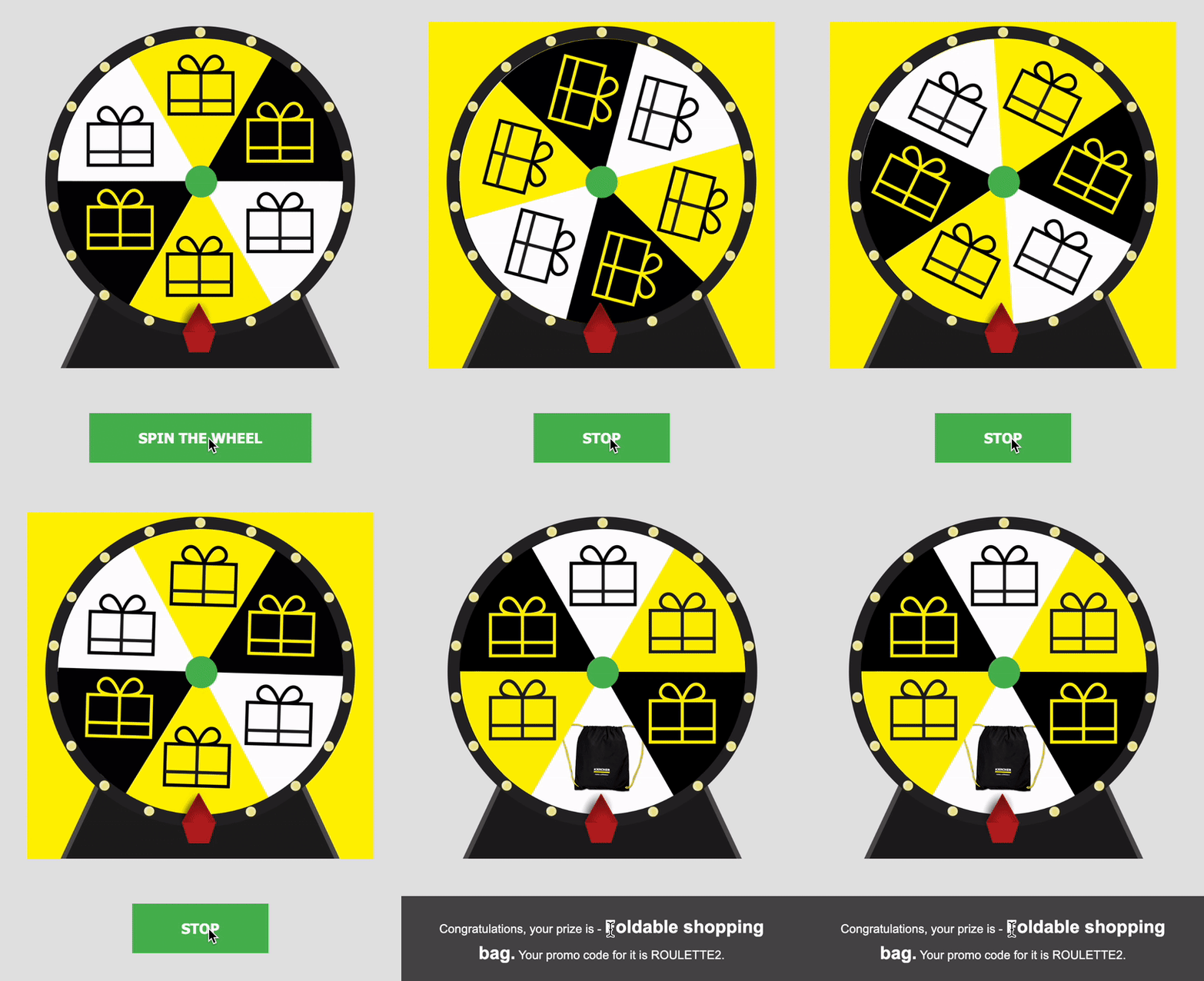
Email from Kärcher
Gamification is an endless field for creative ideas, as almost every festive event can be turned into a gamified element within your email.
What makes it effective?
To create an effective game for your email, it must combine several vital traits:
- Challenging yet achievable goals.
- Clear rules.
- Feedback on the recipient's progress in the game (aka 'progression').
- A character or narrative that is consistent throughout your regular emails.
- Elements of randomness and discovery.
- Voluntary participation.
5. Carousels
Carousels allow marketers to display multiple images or content blocks in a single scrollable area. Recipients typically navigate through carousels horizontally, swiping or clicking through to view additional content. Carousels are effective for showcasing various products, services, promotions, or stories within a limited space, allowing marketers to engage subscribers using dynamic and visually appealing content.
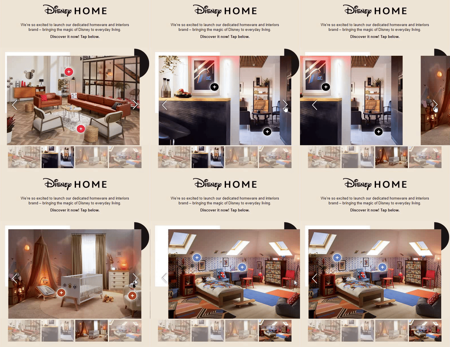
Really Good Emails
What makes it effective?
Email carousels are effective interactive tools when you implement them right.
- Keep the number of slides in the carousel reasonable to avoid overwhelming recipients.
- Ensure that the carousel is optimized for mobile devices, where a significant portion of email opens occur.
- Provide intuitive navigation controls, such as arrows or pagination indicators, to allow recipients to easily navigate through carousel content.
6. Embedded videos
Another type of interactivity that you can utilize for your emails is embedded videos. This type of video is directly integrated into the email content itself, allowing recipients to watch the video without leaving their email clients or templates.

Email from Adidas
What makes it effective?
You can achieve great results by embedding videos in your emails. This type of interactive content can increase your open rate by 19% and your click-through rate by 65%. To achieve such results, you should stick to these tips when embedding videos in your emails:
- Compress your videos to reduce file size and improve loading times.
- Use formats such as MP4 or WebM, which are widely supported across email clients and devices.
- Use appealing thumbnail images with a play button overlay.
- Keep your videos concise and relevant to the email content.
- Focus on delivering your message quickly and effectively to capture viewers' interest.
7. Rollover effects
An image rollover involves two images: the initial one is visible upon email load, and the second is revealed when the recipient hovers their mouse over the first. Image rollovers are commonly used to display products from various angles, in alternate colors, in detailed close-ups, or in gamification. Rollovers enhance user engagement by offering interactive visual content.
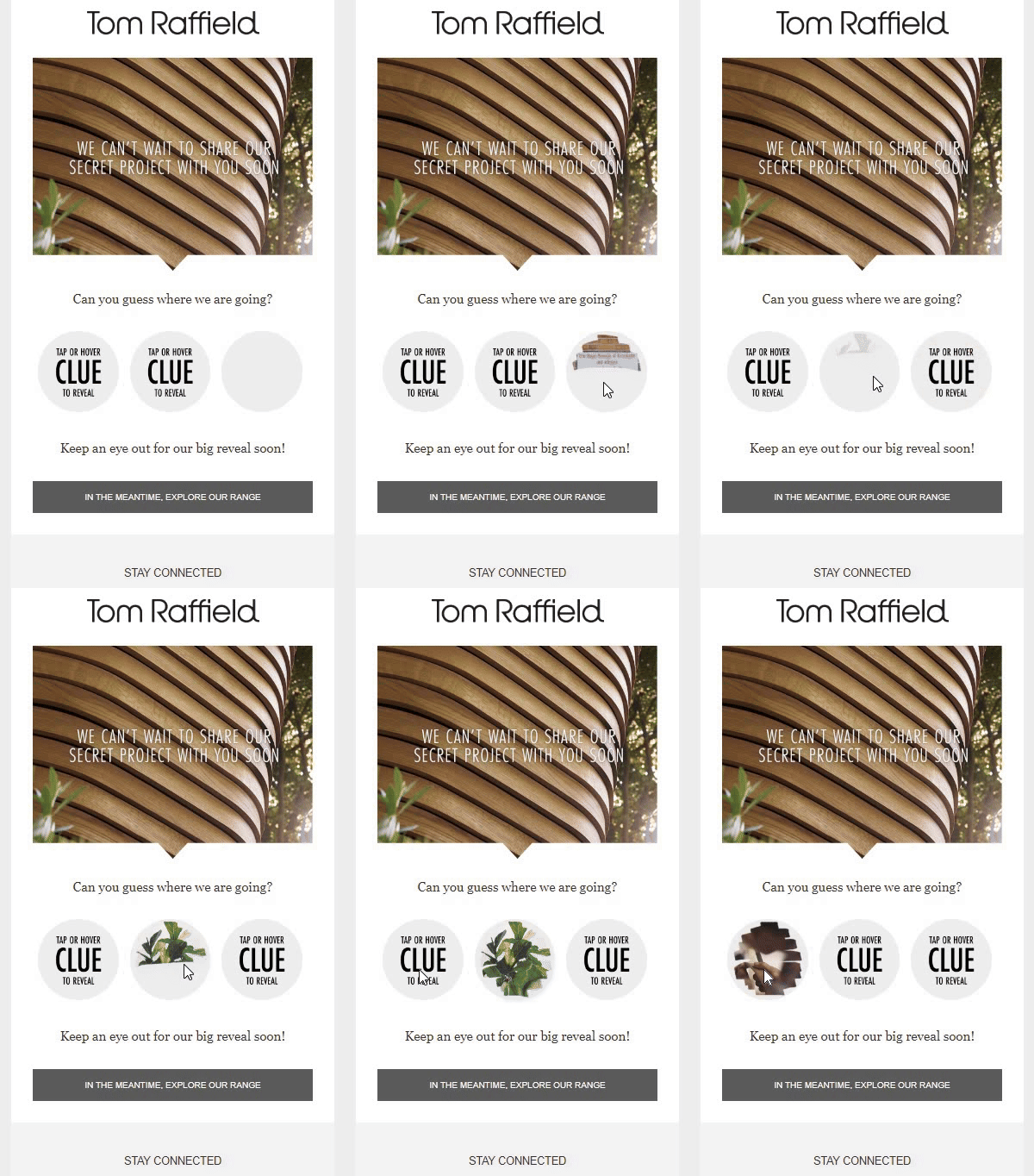
Really Good Emails
What makes it effective?
Rollover effects work great when done right. To implement them without mistakes, you should adhere to the following tips:
- Clearly indicate that the element is a rollover. The email from Tom Raffield in our example, is a great guide to making rollover effects clear for recipients by using a special image that shows that something is hidden behind it.
- Avoid excessive or distracting animations that may detract from the email's message or overwhelm recipients.
- Use touch-friendly alternatives, such as tap or swipe gestures, to create similar interactive experiences on mobile devices.
Technical requirements for email interactivity
As you can see, the range of interactive elements that you can add to your emails is wide. However, before we discuss implementation, it's worth reviewing the technical nuances that you should be aware of for a smoother adoption of this trend. Integrating interactivity into emails requires understanding the basics of AMP HTML and HTML5&CSS to ensure these elements work well across different email clients. It's also important to include a fallback option in the emails. Finally, thorough testing is essential to ensure that everything functions properly and engages the recipients effectively.
Different ways to build interactivity
Creating games and other interactive elements in emails requires a strategic approach to coding. While some developers prefer using AMP for email due to its dynamic capabilities, others opt for the flexibility of HTML5&CSS. However, the most effective strategy often involves integrating both coding dialects to cover more supported email clients and ensure that more recipients can engage with your interactive content.
Email client support of interactivity
Knowing your audience's preferred email clients helps tailor your interactive strategy. This insight guides the choice of interactivity method to ensure maximum visibility and engagement and to make email production cheaper.
For example, AMP for email is supported by the following:
- Gmail on both desktop and mobile devices.
- FairEmail on both desktop and mobile devices.
- Yahoo Mail on both desktop and mobile devices.
These three email clients cover 32% of email users, which means that only a third of your recipients will be able to engage with interactive elements, while 68% (over two-thirds) of your recipients will be unable to engage, which is quite limited for a successful email campaign.
Meanwhile, HTML5&CSS is compatible with the following:
- Apple Mail, both desktop and mobile devices.
- Samsung Mail, both desktop and mobile devices.
- Thunderbird, both desktop and mobile devices.
This additional list adds another 59% of the email client market share. As you can see, combining AMP and HTML5&CSS covers more recipients, which means that more users can see the interactive elements in your emails. Combining these two approaches would cover 91% of email recipients who will be able to see your interactive elements in their full glory.
Fallback
A fallback version acts as a safety net and ensures that every recipient can still access the content, regardless of their email client's capabilities. Essentially, this is an alternative version of the content provided to clients that might not support the advanced features or interactive elements embedded in an email.
The fallback message can take the following forms:
- A static image or content.
- A link to the email's web version (for example, a 'view in browser' button).
- A link to an external survey or quiz.
Fallbacks are necessary to cover a maximum number of email clients, regardless of their support of interactive elements. To be more precise, simple text fallback is required for 9% of email users, the lion's share of which are Outlook users.
Testing
For the interactive elements in email campaigns to work properly, a thorough testing process is required to make sure that your interactive email will be visible in recipients' inboxes.
The effectiveness of your interactive content, whether it's an AMP-powered game, HTML5&CSS, or fallback text, hinges on several factors. These include the recipient's choice of email client, the device they're using (considering factors such as device age and operating system version), and even the web browser they prefer.
Testing across every possible combination of these variables might seem daunting. However, focusing on the most prevalent scenarios can provide invaluable insights into how your interactive elements will perform when they go live. Therefore, it is important to send test emails to a variety of addresses and devices to ensure comprehensive coverage.
Conclusion
Interactive content like quizzes, games, and forms can really jazz up your emails, making them more engaging and fun. Thanks to their responses and interactions, this not only grabs subscribers’ attention but also helps you get to know them better. While adding interactivity takes some tech savvy, especially ensuring it works across different devices and email platforms, the payoff is huge.
It can lead to more subscribers opening your emails, sharing them, and ultimately, boosting your brand's awareness. So, getting creative with your emails could be a game-changer, making every click a memorable moment with your brand.
Sena is a content writer at forms.app. She likes to read and write articles on different topics. Sena also likes to learn about different cultures and travel. She likes to study and learn different languages. Her specialty is linguistics, surveys, survey questions, and sampling methods.


 8 min read
