केवल सीमित समय के लिए ब्लैक फ्राइडे सेल के लिए वार्षिक भुगतान योजनाओं पर 65% तक की छूट है। ⏰

If you want to improve your conversion rate, look no further than your landing pages.
A landing page is where a user ends up after clicking on one of your ads. It’s created to promote a specific campaign, product, or promotion.
Unlike other pages on your site, the only purpose of your landing pages is to guide visitors towards taking the next step in their customer journey. Therefore, its design can significantly affect how many leads your website captures.
Here are six tips you can use to create a high-converting landing page that increases your conversion rate and ROI.
Photo by Domenico Loia on Unsplash
1. Add an interactive lead generation form
Adding an interactive lead generation form to your landing page can help increase your conversions because it allows you to collect the information of potential customers who are likely to convert.
Here are some ways you can get the best results from your lead generation forms:
- Place the form above the fold
- Include only the most essential fields
- Consider the best length for your target audience
- Write a solid call to action
- Include your privacy policy to build credibility
Always be upfront about why your user is filling out the form, too. If you plan on incorporating this lead information into your email marketing campaign, for instance, offer something in return. A valuable download or special offer is sure to keep website visitors happy.
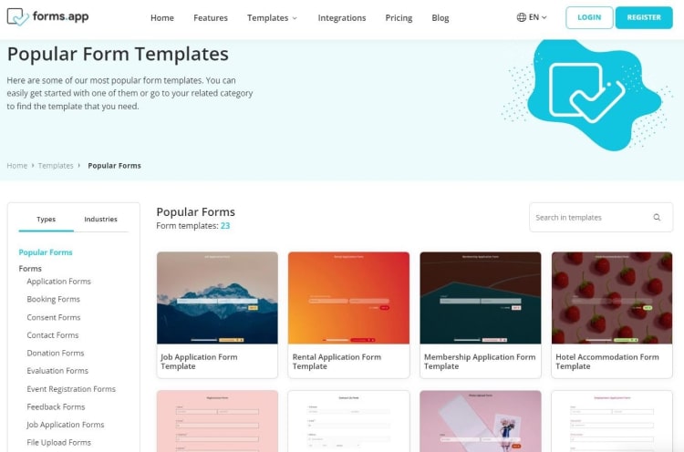
If you’re looking for ideas, forms.app has great interactive landing page form templates that make it easy to design engaging forms for any purpose. Not only is there a template for every type of landing page, but their eye-pleasing designs will surely entice your visitors to convert.
As you look for a lead gen form for your site, make sure you find one that uses a minimalist design and has the fields you need when collecting information from your customers. Different industries need different amounts of information from users, so consider what’s going to work best for both you and your audience.
2. Tell visitors to convert with a strong call to action
A call to action is a brief phrase that lets visitors know how to take action. Your landing page’s copy should communicate your value proposition, while the call to action (CTA) is focused on getting them to convert.
Having a strong CTA will help you get more form submissions because there will be no question about what your reader needs to do next. But, before you can persuade them to convert, your users need to notice your CTA.
Here are some ways you can ensure your calls to action are effective and eye-catching:
- Make one specific request
- Grab the user’s attention with bright colors and persuasive language
- Highlight a clear path forward
- Offer an incentive to click
- Test different CTAs to find the most effective one
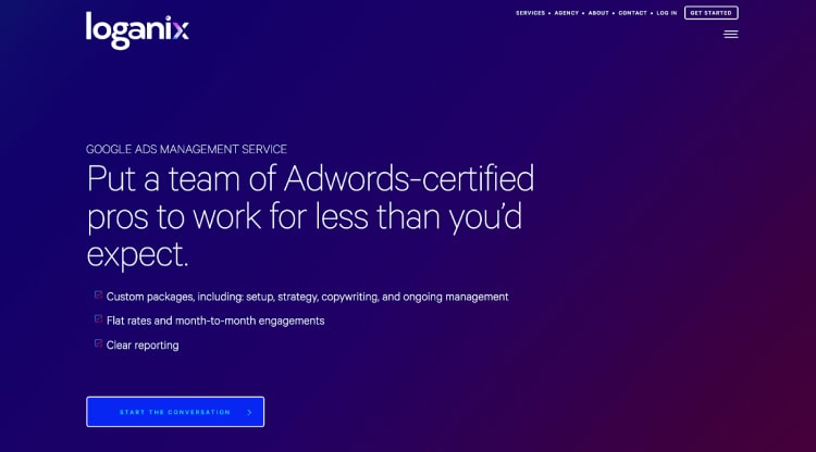
For example, take a look at Loganix’s Google Ads management service page for inspiration when it comes to creating a strong CTA that drives conversions. We use high contrast colors, solid persuasive language, and a prominent CTA above our website’s fold or scrolling point.
The CTA button is clickable and clearly outlines what the visitors can expect. Always choose a color that stands out from the rest of your landing page design to ensure customers can easily find it.
Also, remember that your CTA should outline the desired action you want your visitors to take. So, make design choices that draw their eye and convince them to convert
3. Provide evidence of your abilities with social proof
No matter how much you boast about your product or service, website visitors just won’t believe you until they get a second opinion. So, you’ll need to reach your audience with some social proof.
Positive social proof is essential for boosting your conversions because it builds your credibility and helps potential customers to feel comfortable about doing business with your brand.
Providing social proof is an essential part of the sales process because you need to establish trust with your audience as quickly as possible. You can use several types of social proof on your landing pages, like:
- Reviews and testimonials
- Media mentions
- Awards and qualifications
- Mentions of well-known customers or clients using your products or services
If you display high-quality social proof on your landing page, it will put users at ease and back up your claims. You can ask previous customers for feedback and testimonials and reach out to media outlets and influencers to let them know about the amazing things your company is doing.
Let’s take a look at an example of how companies use social proof to drive conversions.
FreshBooks, an accounting software company, uses average star ratings and feedback from prominent industry influencers to promote their business.

Notice how the social proof quote they have chosen to display appeals to the needs of a busy business owner. FreshBooks also displays their average star rating with the total number of reviews. This type of information is essential to help them win the hearts (and wallets) of small business owners looking for the best accounting software for their businesses.
You can follow the same principles on your landing pages by adding persuasive social proof to earn the trust of your audience. Compile your customer reviews and choose excerpts to speak to your target audience. Including user-generated content or customer pictures will also go a long way towards convincing your visitors to convert.
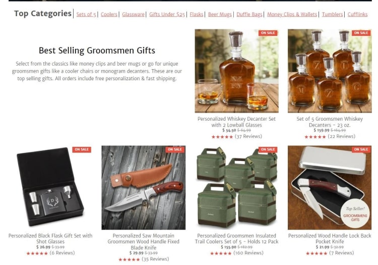
Another excellent example of on-site social proof comes from the groomsmen gift supplier GroomsShop. Since the company knows their customers are looking for quality gifts to give to their groomsmen, the site does a great job of establishing trust and reassuring potential customers that their recipients will love their gifts!
The business does a fantastic job of using a star rating system for each product on its main category pages. This gives a quick reference for customers as they look through the large library of products offered on the site. You can use the same design trick on your website to ensure customers find the products they need quickly and easily.
4. Choose your landing page imagery carefully
Imagery can be fantastic for helping customers feel more connected to your business, excited about your products, and tempted to make a purchase. According to forms.app, engaging images can increase your conversion rate by as much as 80%.
This means you will want to use effective imagery that shows your business in the best light possible. You can go in several different directions to incorporate engaging imagery into your landing page design. You could:
- Use product imagery that shows how items work
- Use images of your staff members to humanize your business
- Create illustrations/diagrams that help customers to understand what you do
- Showcase imagery of people who represent your customers to make them feel welcome
Take a look at the landing page of Smith.ai, which offers a 24/7 answering service. They have chosen one anchor image that embodies their company’s message. The customer service representative in the image has a cheerful expression, wears a headset, and even has a shirt that matches Smith.ai’s color scheme.
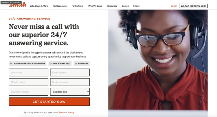
As you select imagery for your landing page, opt for bold, eye-catching graphics related to your product or service. Keep your target audience in mind and choose imagery that speaks to their needs when it comes to your products or services.
5. Make it very easy to convert
To increase conversions, your landing page needs to be intuitive. The easier it is for someone to take the next step with your business, the more likely they’ll be to make a purchase.
So, you should take steps to ensure people can quickly take the desired action on your landing page without any problems. This means the desired pathway needs to be highlighted for all users from your banner to your contact form.
Let’s look at some examples of companies that make it easy to convert on their sites with excellent copy and CTAs.
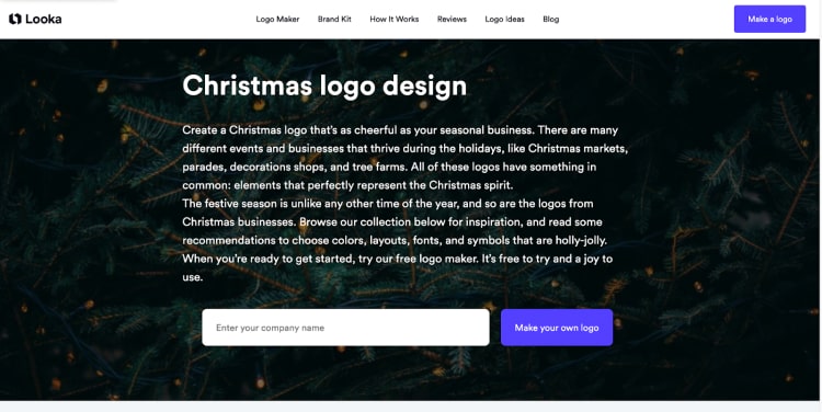
Looka, a logo design company, keeps its landing page simple with a block of copy and a prominent, bold CTA that alerts the visitors to what they need to do next. This page design leads potential customers through the customer journey seamlessly, so they are more likely to convert in less time.
Thanks to the simple design, there is no question about where the users should enter their company’s name and what will happen once they click the purple CTA button.
When planning your landing page, you can use this as inspiration by identifying the action you want users to take and making design choices that point your customers there.
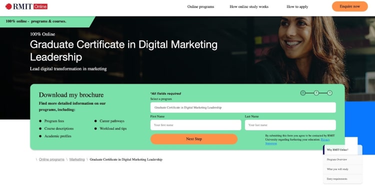
Another great example comes from RMIT Online. Everything a user needs to convert, from their brochure contents to the fillable form, is right at the top of the landing page. Since potential students are likely to have lots of questions about continuing their education, RMIT Online does a great job of leading people through the process to learn more about their degrees and answer common queries future students have.
You can use a similar design and sales funnel strategy on your landing pages with a minimalist design and include fields to collect information about your customers so you can continue to build a relationship with them. Remember, your landing page is essentially a fast track through the sales funnel, so make sure your visitors can’t miss your CTA so they can sign up, subscribe, or buy from your company.
6. Keep the design of your landing page simple
It may be tempting to pack tons of visuals and information onto your landing page, but this is counterintuitive.
With a busy page, you risk people getting distracted or feeling overwhelmed. Therefore, it’s best to provide the essential information and page features to convince visitors to convert.
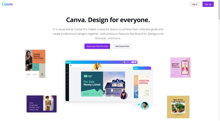
The design platform Canva uses a simplistic design and minimal page copy to offer their page visitors a clear path.
Notice how the Canva PRO trial button is bright and eye-catching. There is also plenty of whitespace to make the critical information stand out. The visuals are easily spaced out and connect directly to the goal of the landing page: to entice users to sign up for their pro design account to make stunning digital designs.
To find the right design for your landing page, create two versions and do some A/B testing to see which one performs better. Be very purposeful with your web design choices, and you’ll have a high-converting landing page in no time.
Summary
A high-converting landing page will make all your marketing goals happen. Luckily, it’s not difficult to design a powerful landing page that makes visitors want to click, buy, and convert.
Use these six tips to create your landing page, and you’ll see an increase in your conversion rate and a boost to your ROI.
Want more articles about improving your eCommerce business? Check out the forms.app blog for more helpful content you can use to meet all your business objectives.


 8 min read